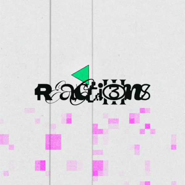
Reactions Vol.3
Reactions Vol.3
Branding and visual identity for the Reactions Vol.3 realease on Erbium Records.
In focus
Reactions Vol. 3 is a living, breathing mass of tones, textures and creativity; laying the foundations with chug-wise steppers and downtempo oddities, evolving to a climactic midpoint through breaks, bass, and techno amalgamations, before contracting back to resting point with lighter states of euphoric prog-house and dub.
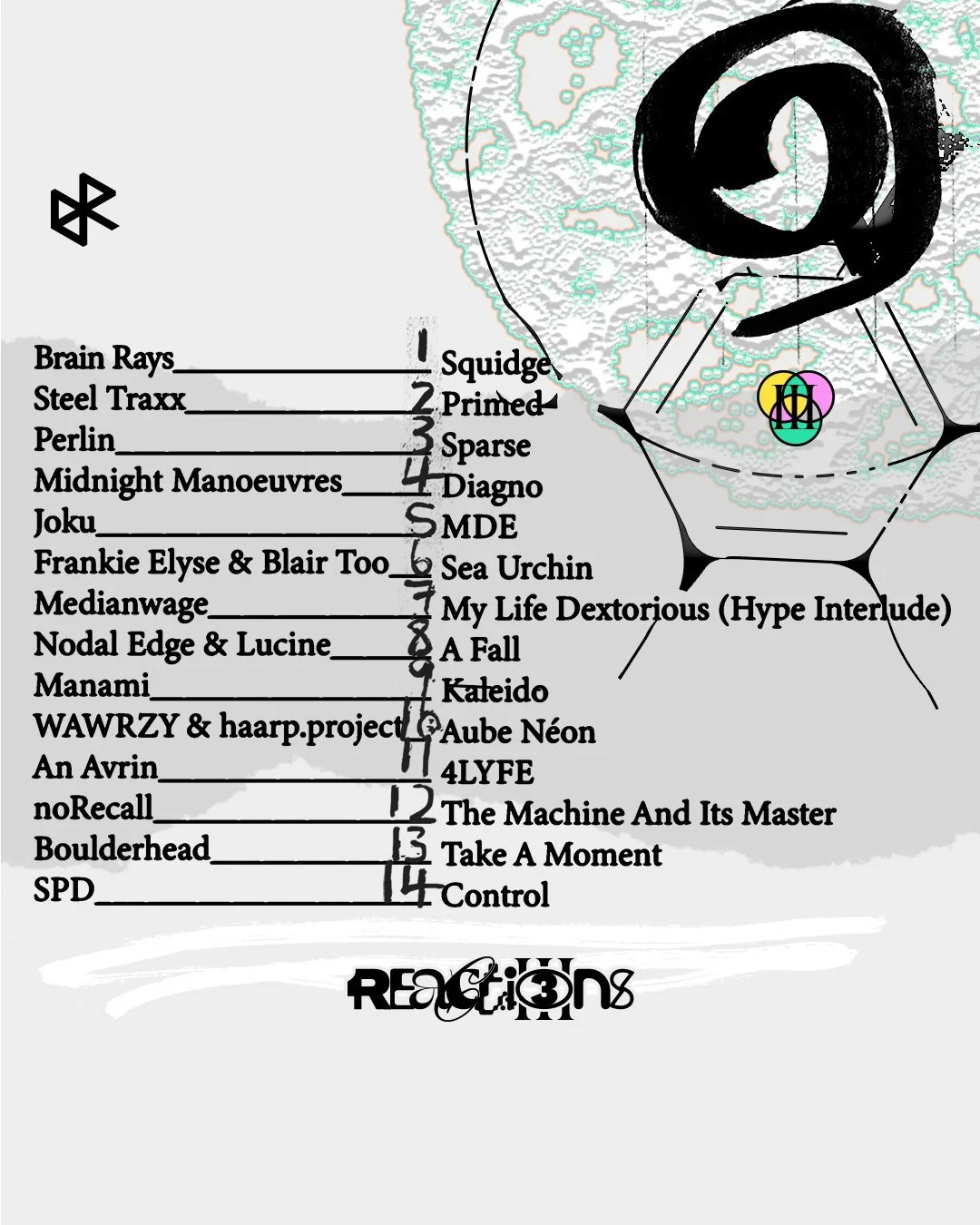
With 14 original tracks from artists and producers across the globe, this is our biggest and most ambitious digital release project to date. Welcoming both new and returning faces who continue to push the threshold of electronic music, this is an exciting new milestone in Erbium's perpetual pursuit of growth and experimentation.
The overall Identity of the release is to show the theme of chemical reactions being portrayed by the 14 artists and their tracks coming together as Reactions Vol.3
Typography
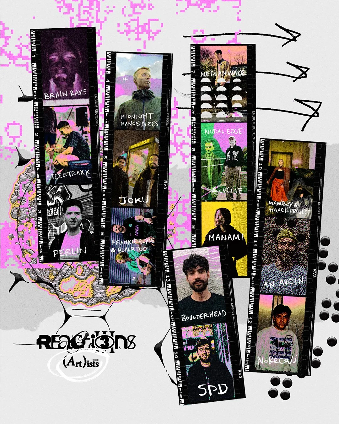
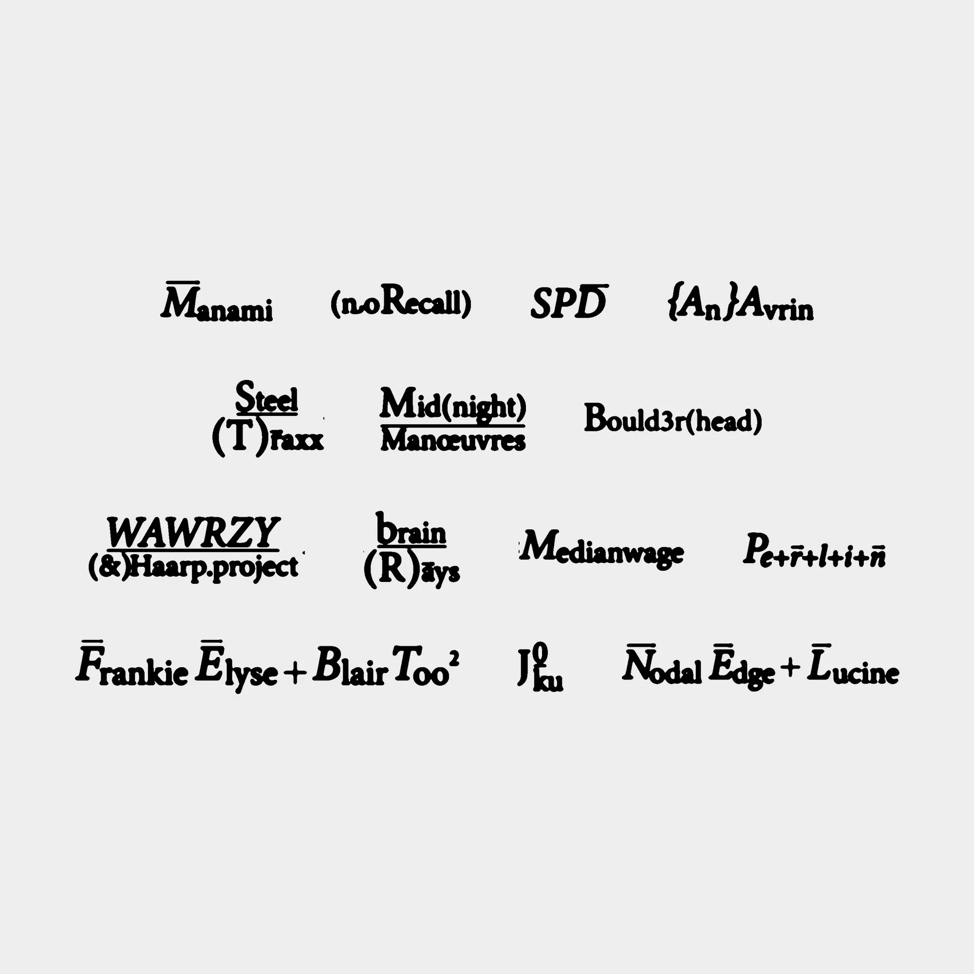
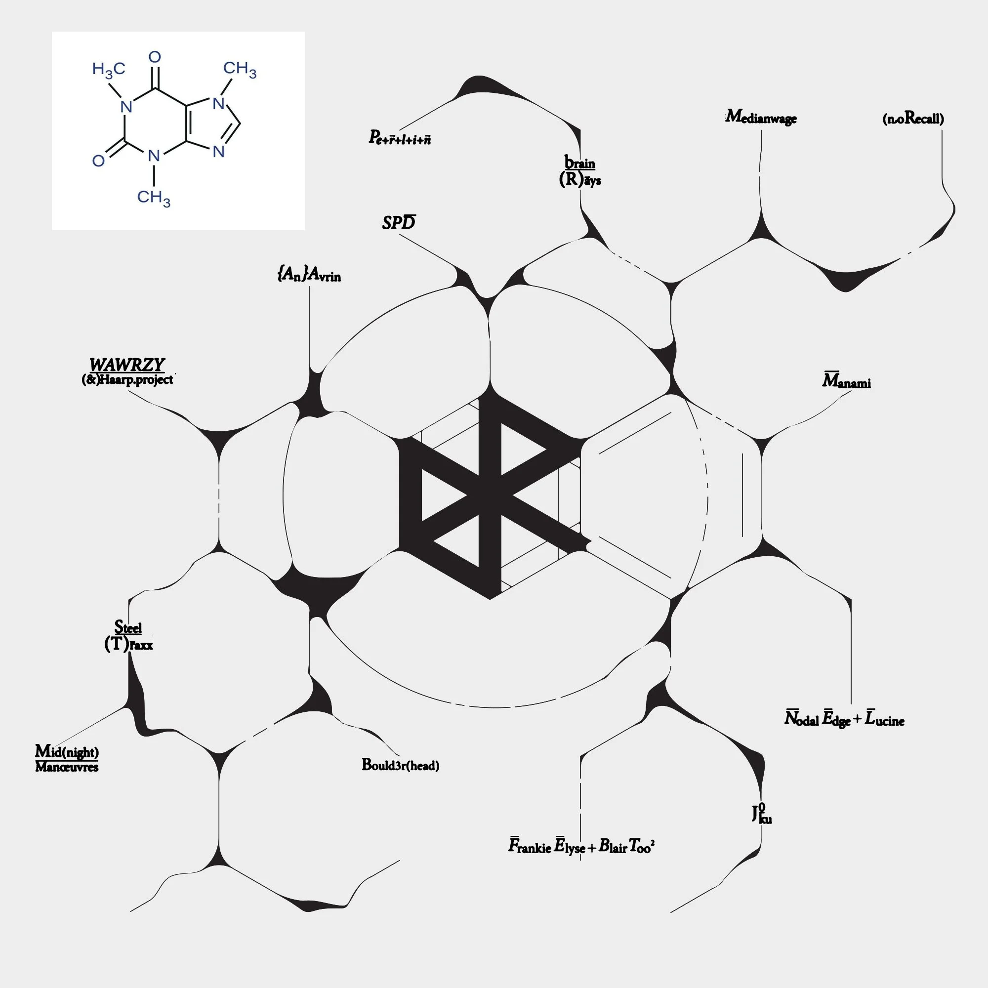
The typography used for the artist names on this release complements the overall chemistry themed aesthetic of Reactions Vol. 3. Each name has been stylised to resemble scientific notation or chemical formulas, and their placement across the sleeve mirrors the branching, interconnected layout of a molecular structure diagram. The result is an abstract, science inspired visual system that ties the artwork and concept together seamlessly.
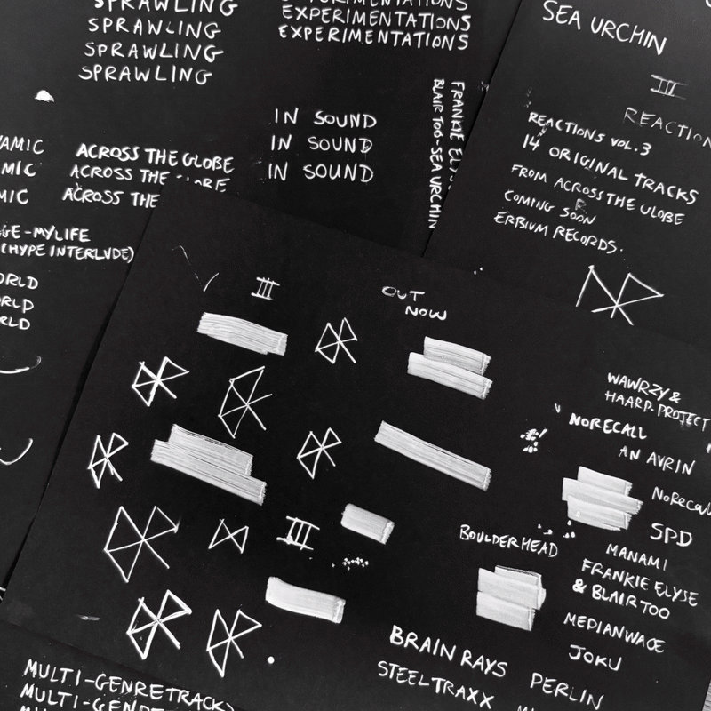
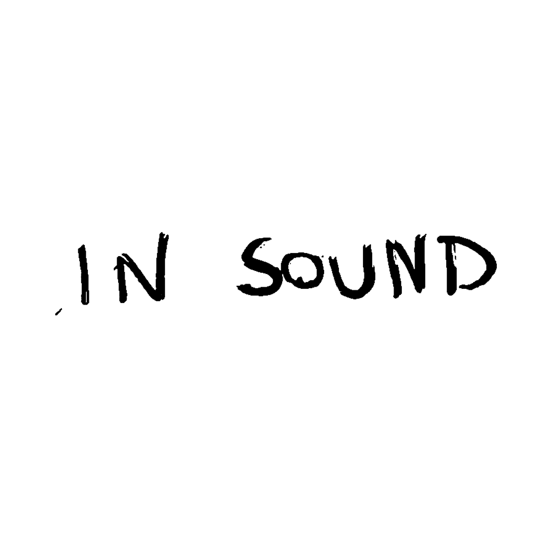
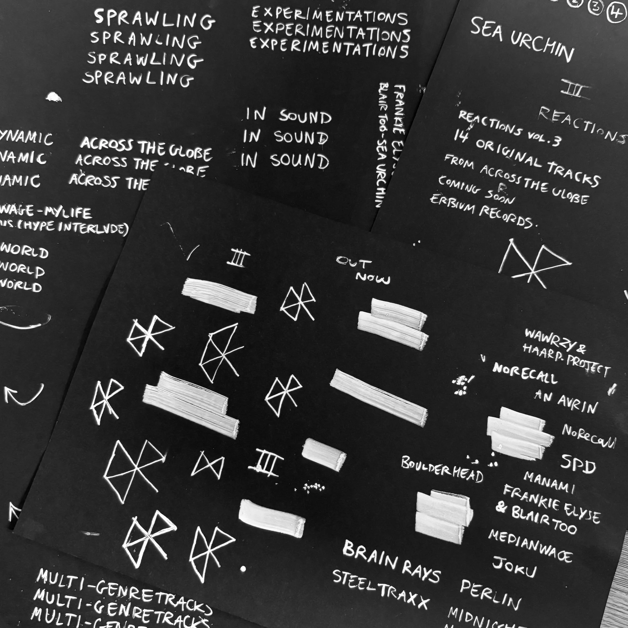
I introduced handwritten typography into the visual identity of the release to give it a more personal, bespoke feel. These hand-drawn words also nod to the idea of note taking, almost like the rough, observational notes made during scientific experiments. By creating multiple variations of the same text, I was able to achieve a jittery, frame-by-frame animated effect that reinforces the project’s experimental energy.

Visual Language
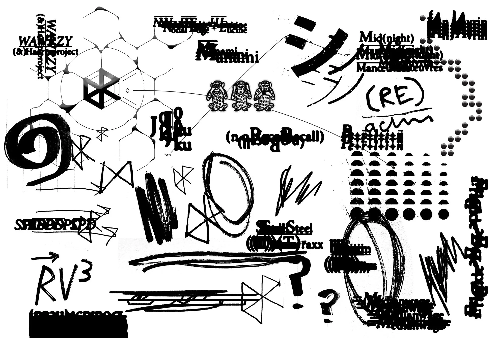
To support the release, I developed a collection of visual assets that expand on the project’s chaotic, chemistry inspired identity. These elements include hand-drawn marks, distorted typography, experimental shapes, and rough graphic motifs. Together, they form a raw, energetic visual language that can be used across layouts, promotional materials, and animated assets to reinforce the project’s aesthetic.
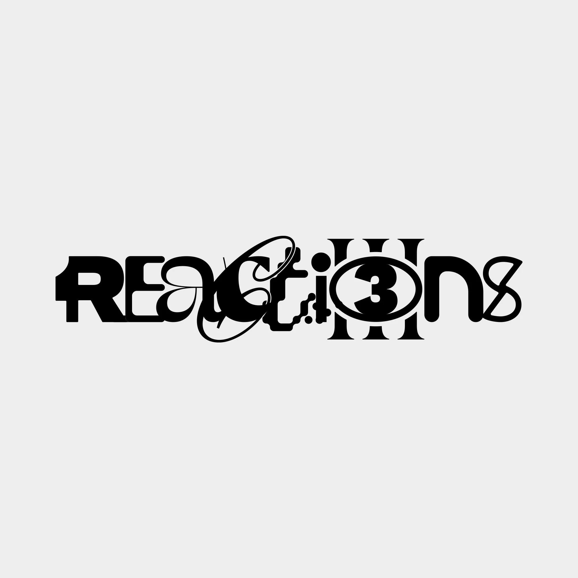
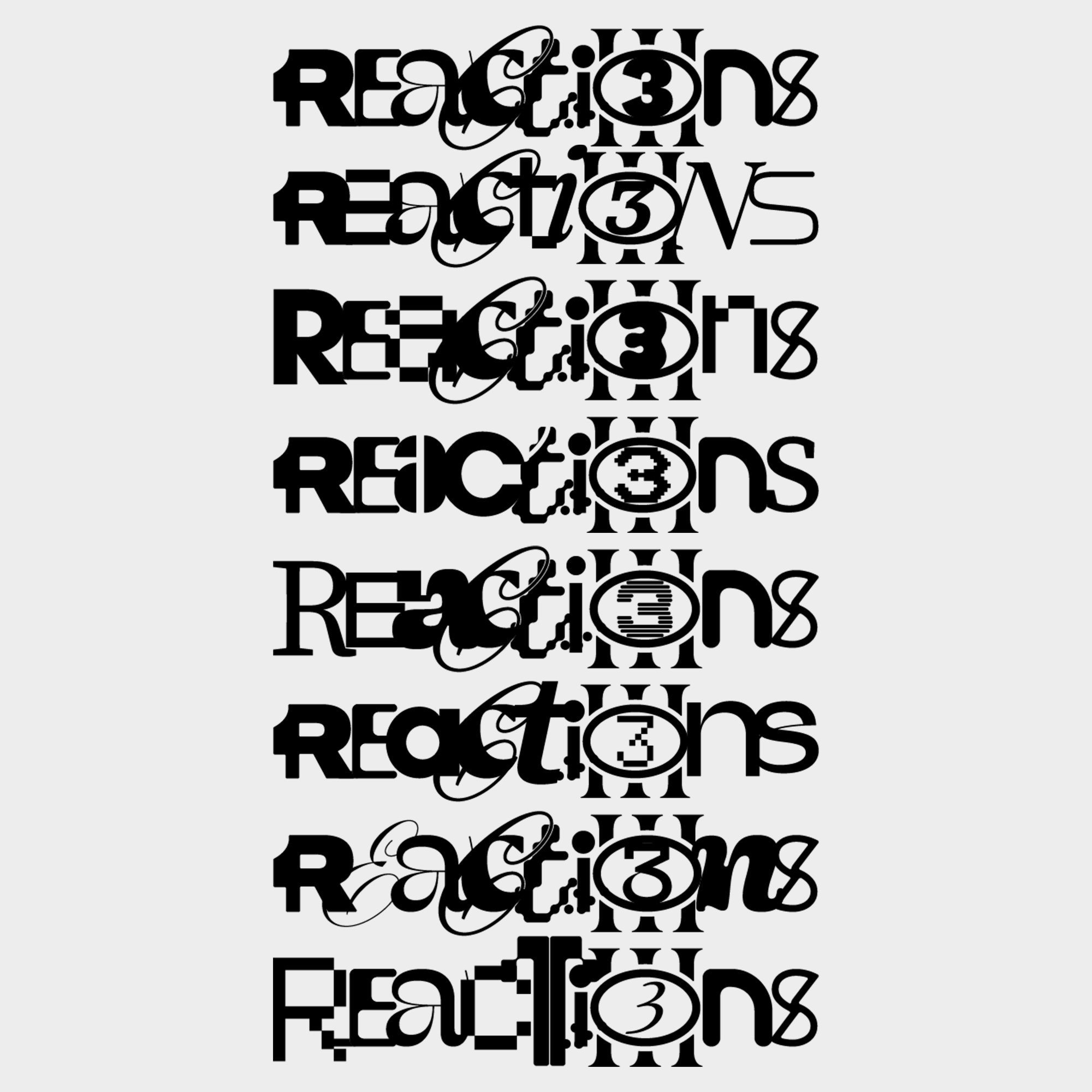
Logo
The logo is built from a mixture of different fonts to reinforce the concept of the release, multiple artists coming together and interacting like chemical reactions. I designed several variations of the logo, and when these versions are sequenced frame-by-frame, they create a dynamic, stop-motion–style animation that mirrors the project’s energetic, experimental character.
Graphic Elements
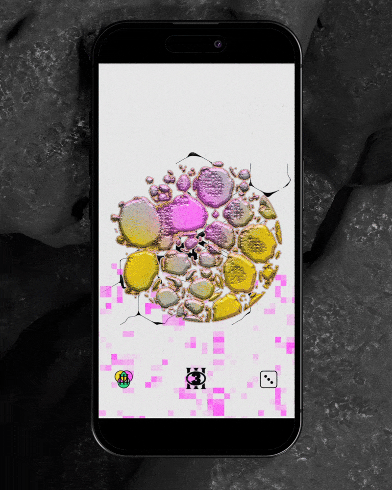
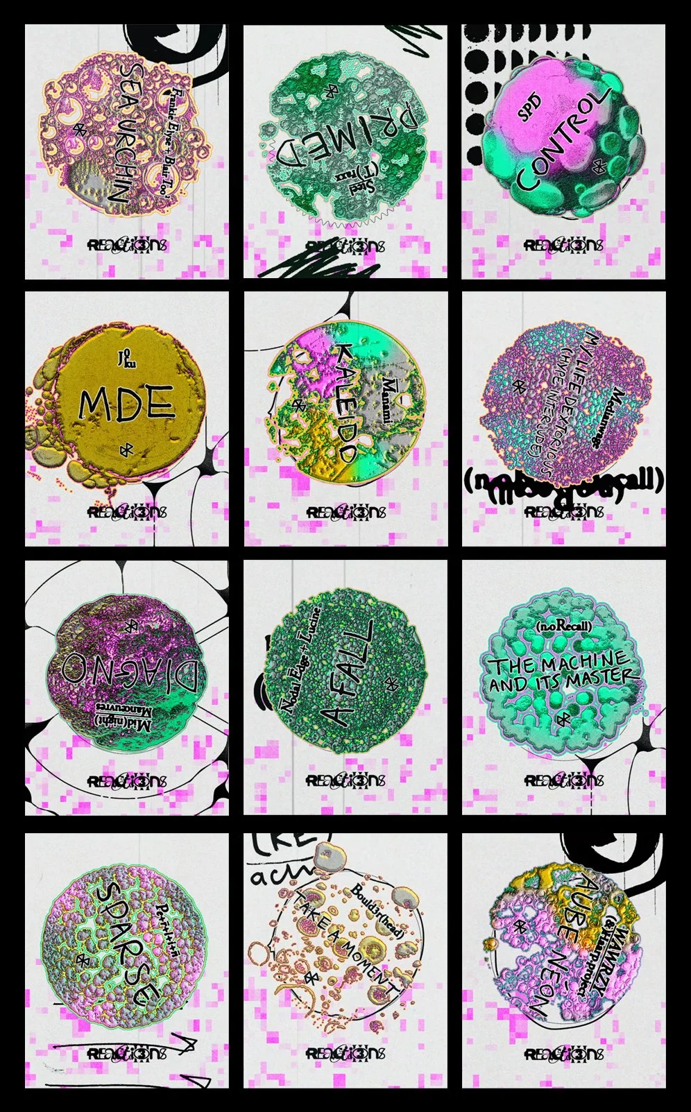
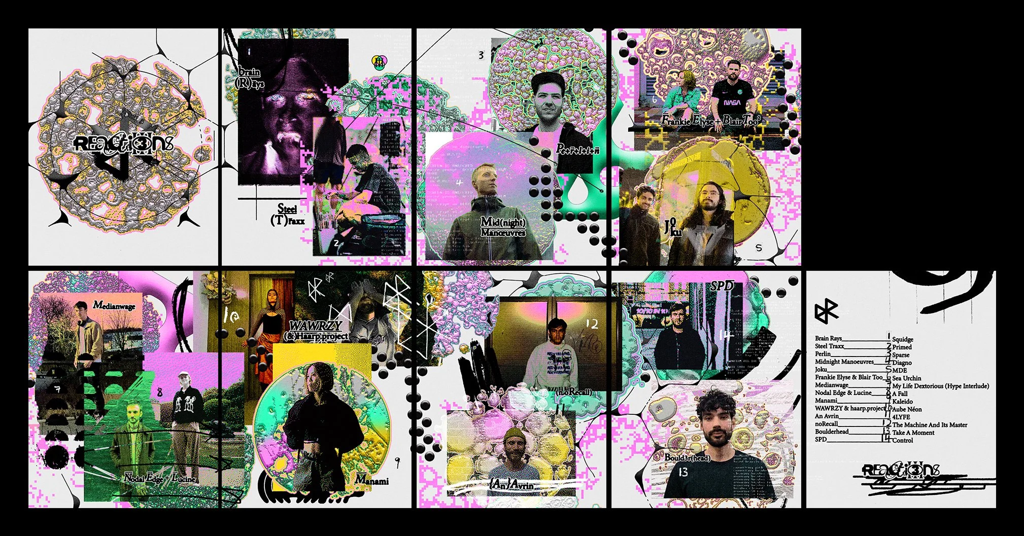
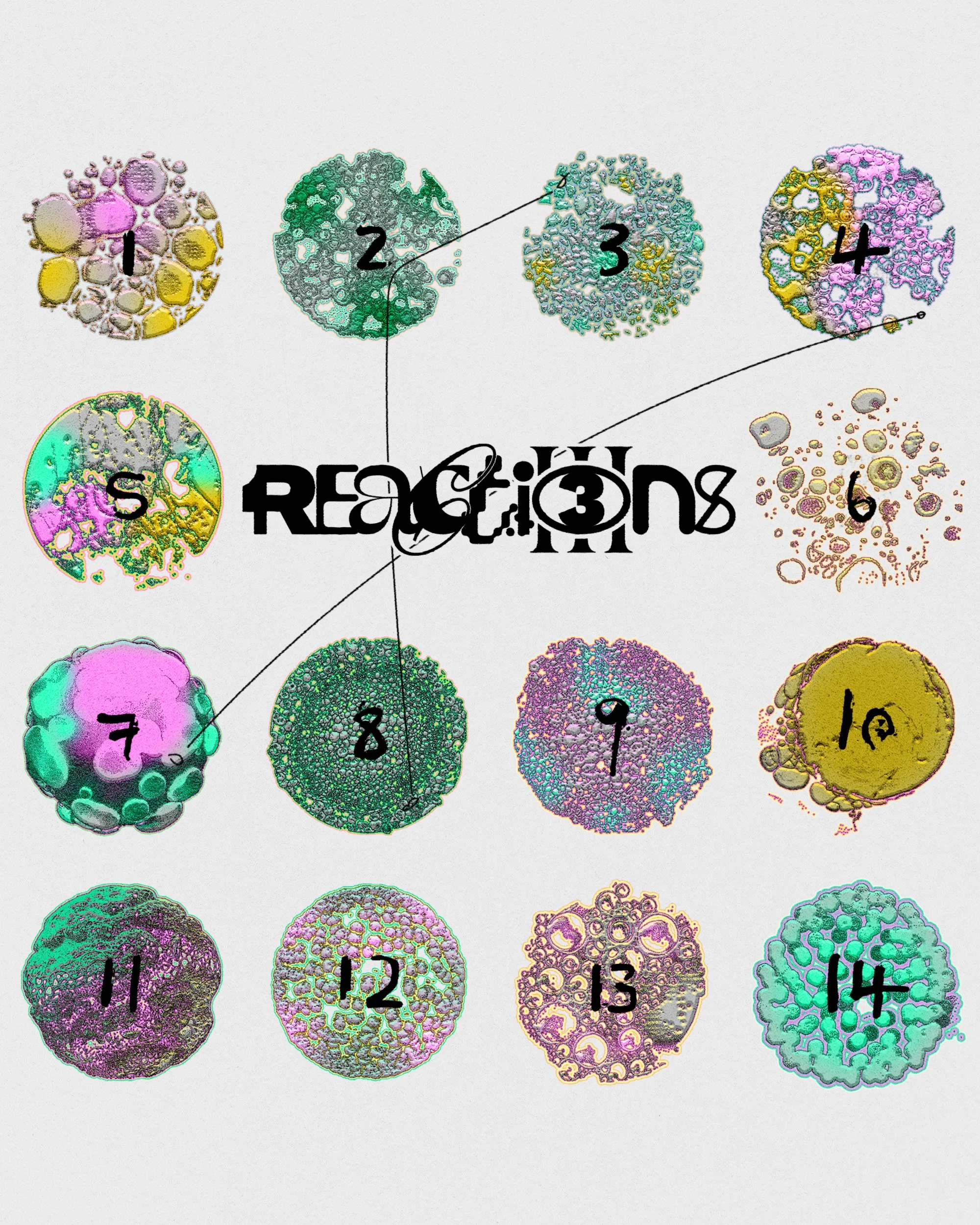
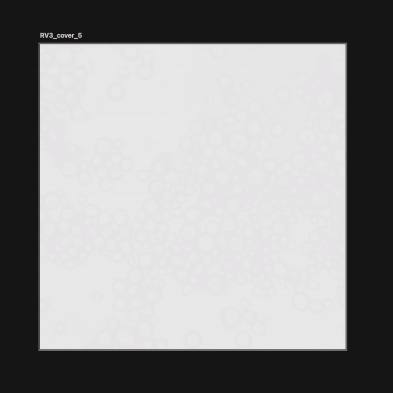
With 14 artists featured on the release, I wanted to create visual elements that represent each artist and their individual tracks. I developed 14 unique abstract “cell” illustrations, imagery that feels like something you might see through a microscope. These graphics help distinguish the different tracks while reinforcing the concept of chemical reactions and elements coming together. The result is a set of organic, scientific-inspired visuals that tie the entire project’s identity together.

Cover art iterations
A quick look above to some of the previous workings of the Reactions Vol.3 sleeve design to give more of an insight to the design process.

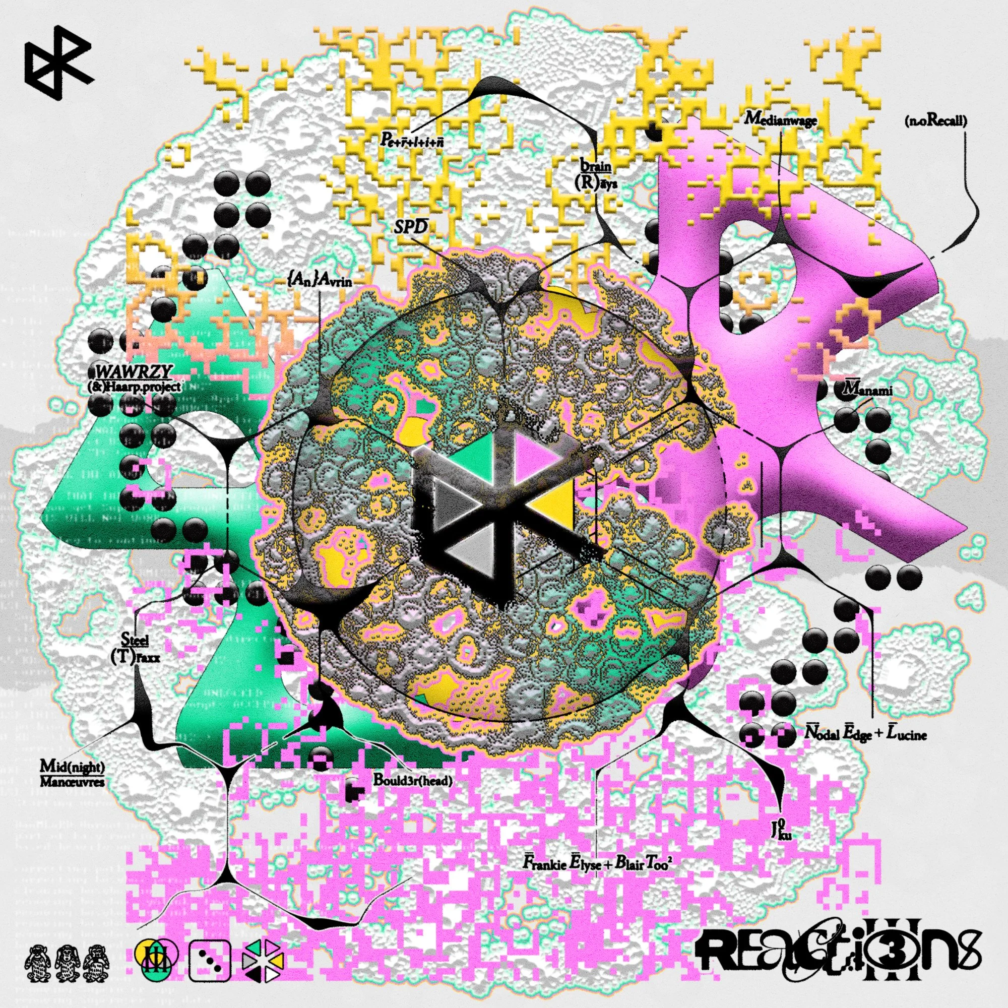
Cover Art
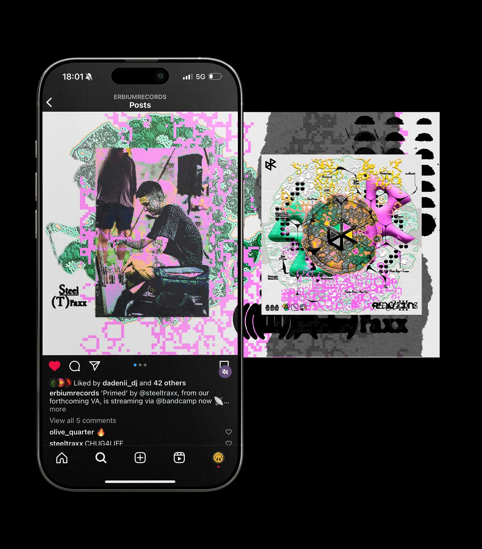
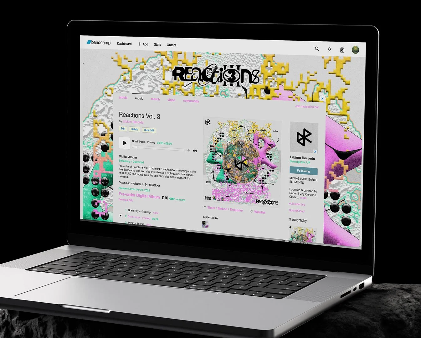
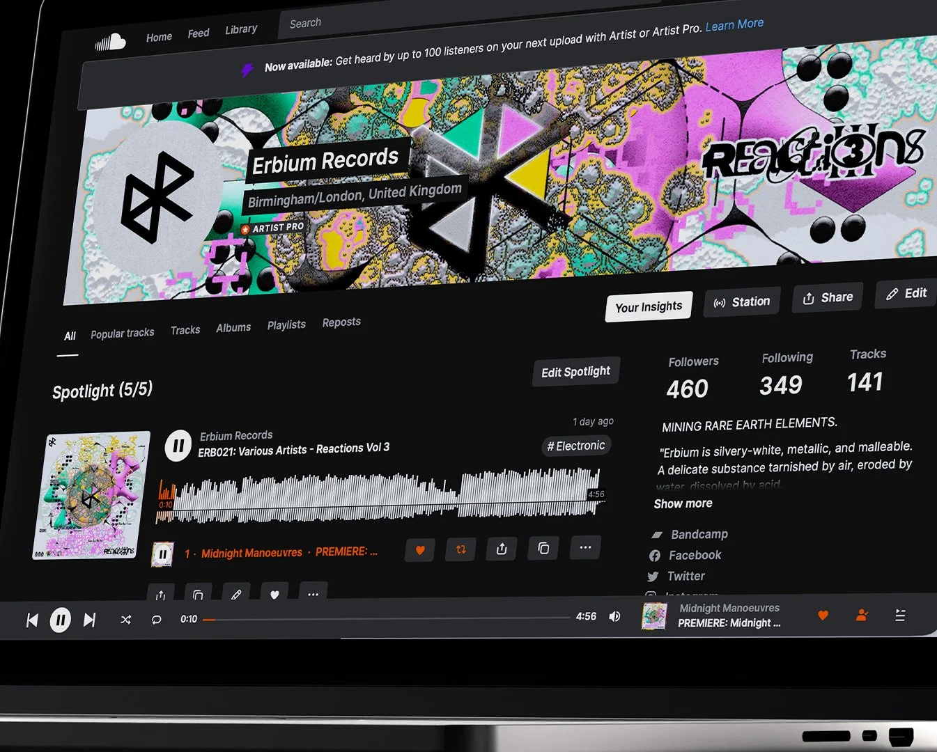
You can see some of the visual assets mentioned above being used for the cover art of the release. The centre circle houses the Erbium logo surrounded by an abstract molecular structure diagram connected the featured artists names, reinforcing the concept of Reactions Vol.3
The identity in action
Now that you’ve seen the thinking behind the design, here are examples of how all the visual elements come together in practice. These assets show the full identity applied across social content such as carousels, teasers, web branding, track lists, artist spotlights, and other promotional visuals, demonstrating how the system works as a cohesive whole.