Racked Records
Racked Records
Racked Records branding
and sleeve design.
In focus
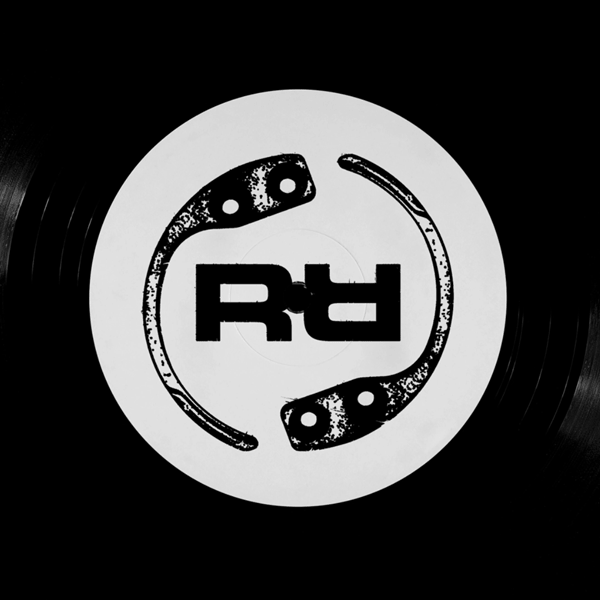
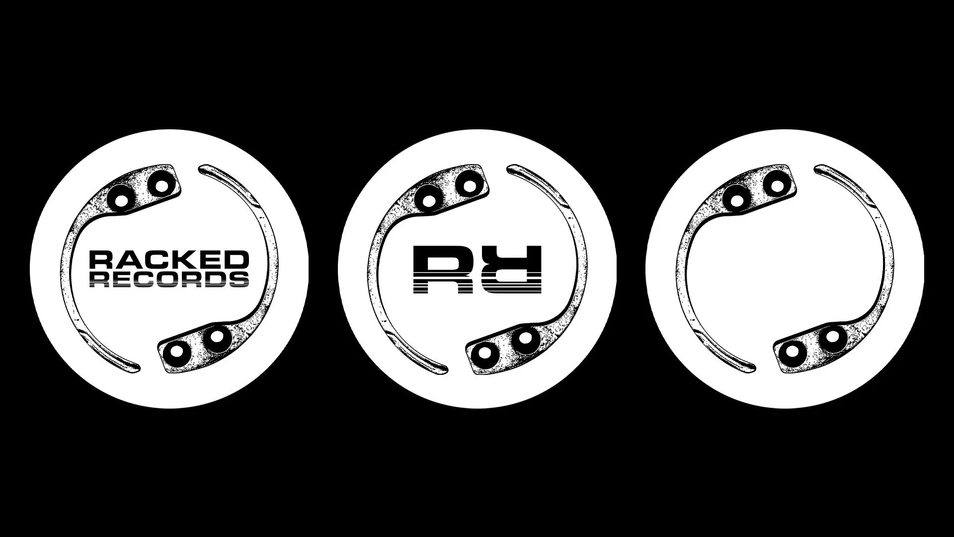
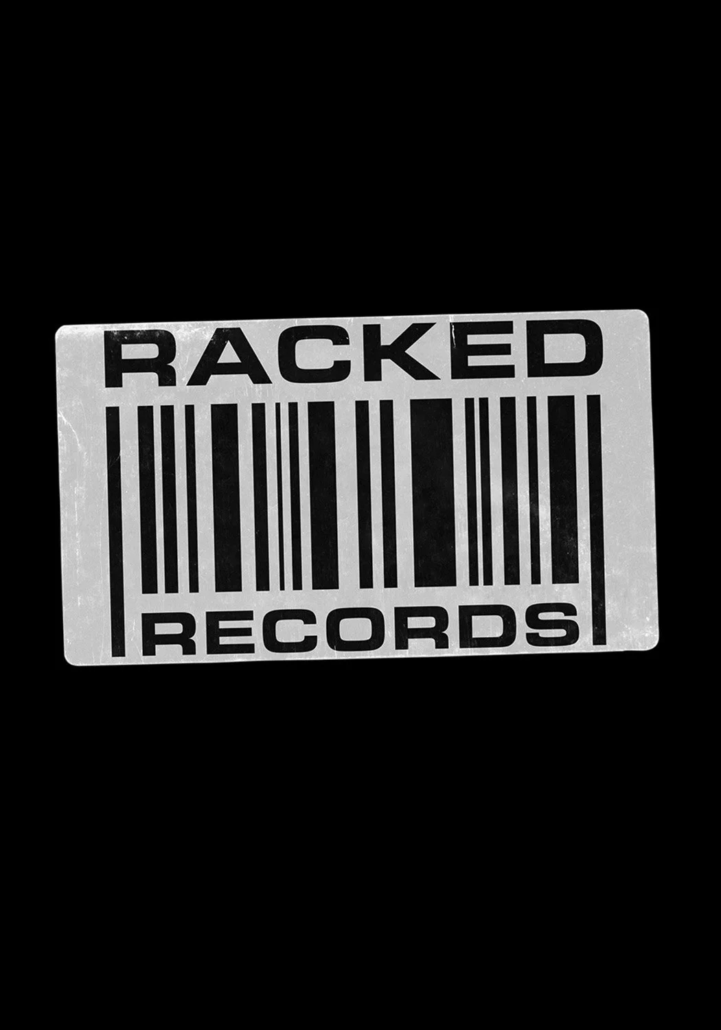
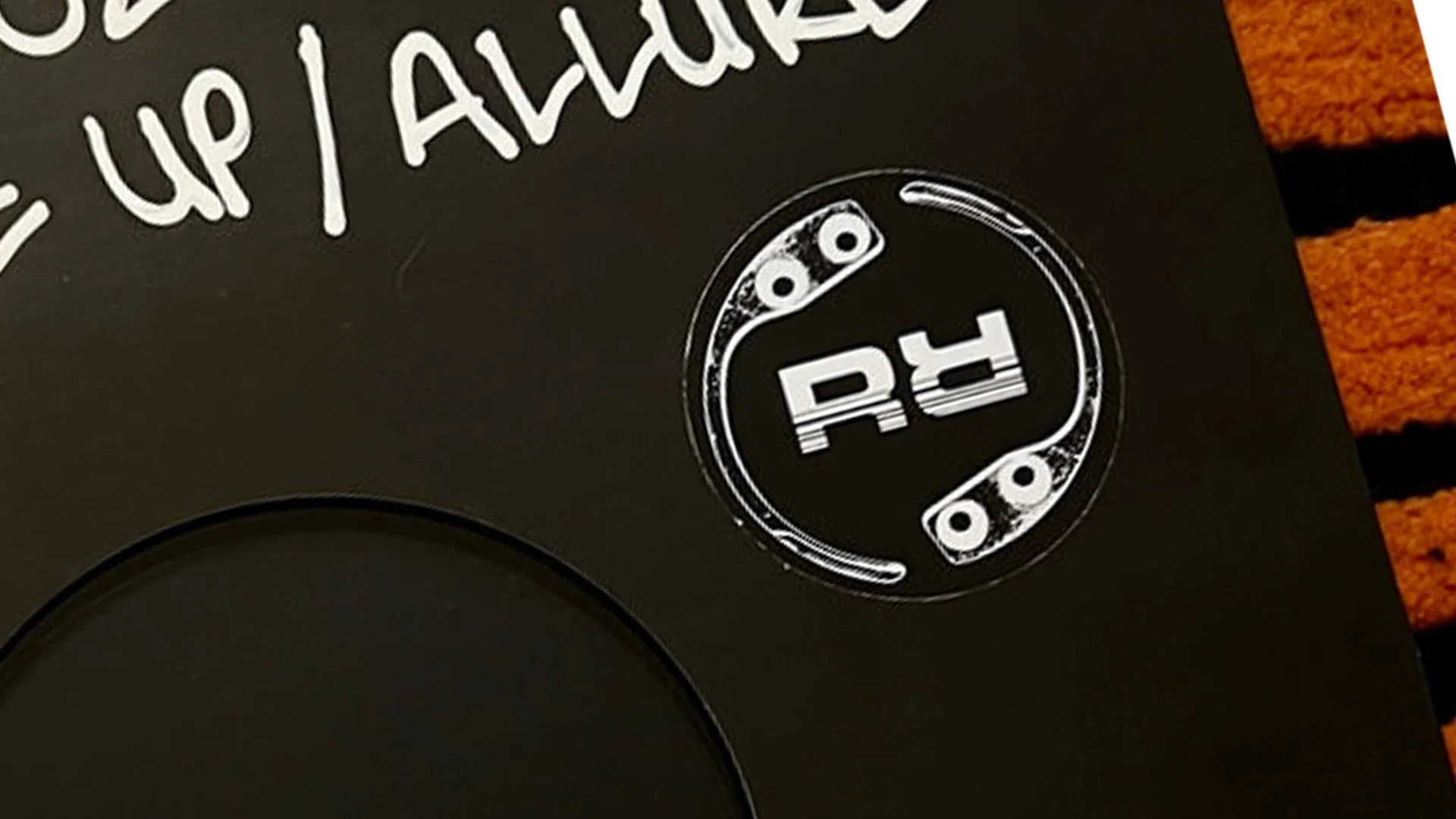
I was asked to help come up with an identity for record label Racked Records. For the logo the brief was to include some sort of security tag that you would usually find on some products/items of clothings in stores. I wanted to create something minimal but also to bear in mind that the logo would be seen on record centre labels, so I wanted it to look cool if it was spinning on a record. As well as this I also designed the artwork for their second release ‘Sweet Chilli EP’ by Samurai Breaks along with a few animated assets for socials.
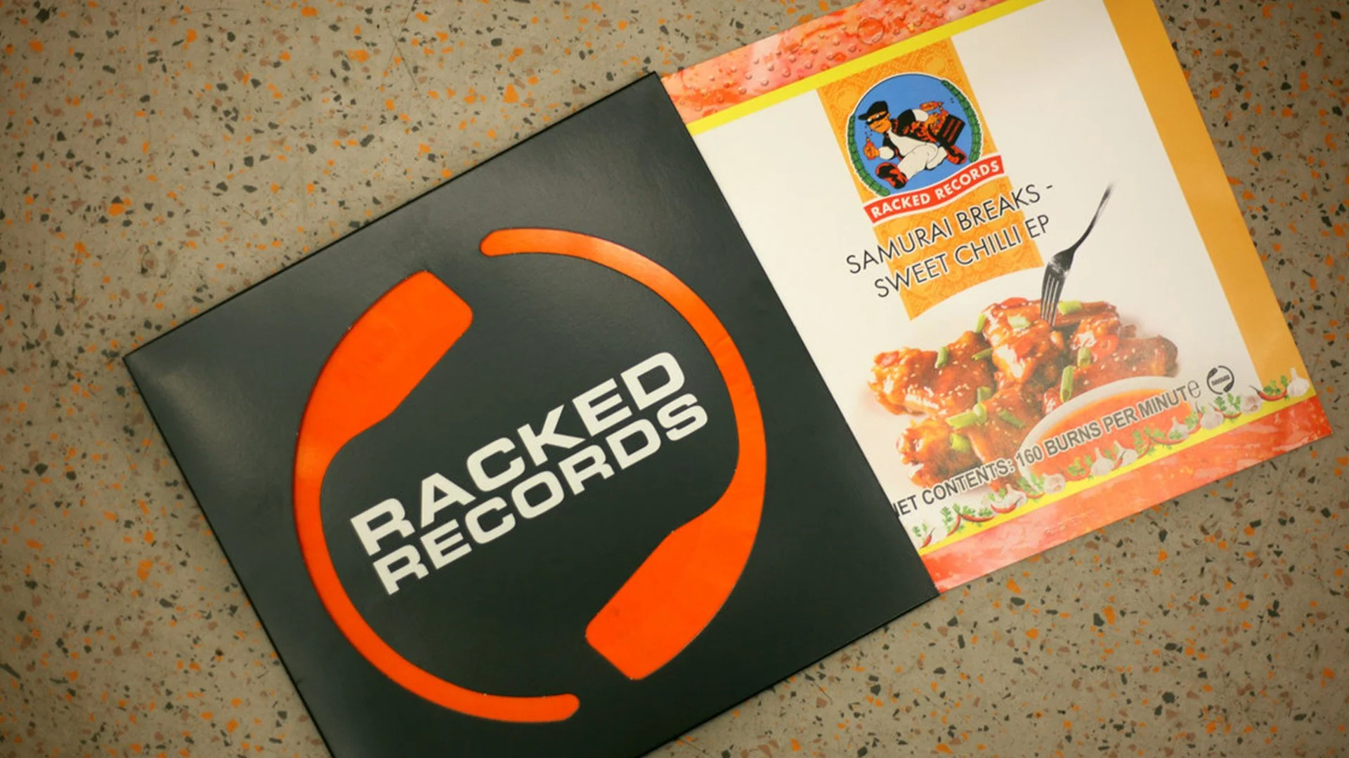
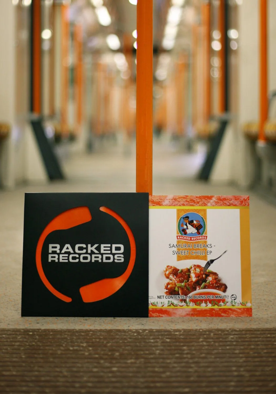
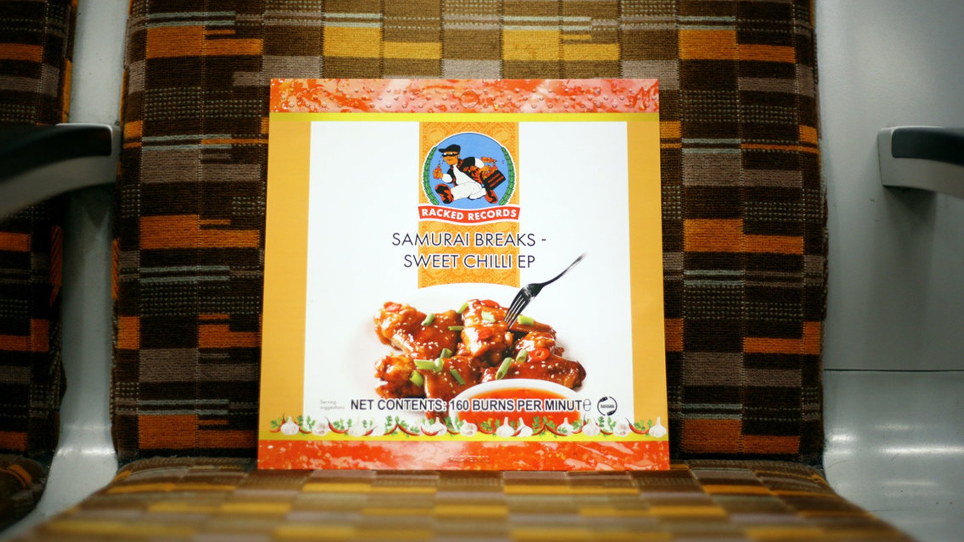
Sweet Chill EP
Designing the artwork for the Sweet Chill EP by Samurai Breaks was such an enjoyable project. The brief was to make the sleeve resemble the packaging of a Thai sweet chilli sauce bottle. To achieve this, I styled the top and bottom of the sleeve to mimic the plastic bottle, with the "sauce" visible behind it. The label was intentionally designed with a slightly "stock image" feel to enhance the aesthetic, featuring playful nods to nutritional details you’d find on real packaging—reimagined with a musical twist, including the tracklist and a cheeky note of 160 burns per minute.
Credits:
Sleeve photography: Cicely Grace.
Racked Records logo illustration: Tavs World.